01 / Overview
Brand specification
Identity, aesthetics, and technical specifications for the Strange Loops brand.
A reference for anyone designing with or for the studio.
02 / Identity
Strange Loops is a software studio
Strategický partner pre AI, web a digitálne platformy.
Strange Loops is a software studio based in Slovakia, small by design. We partner with visionaries and domain experts to architect and build the systems behind their ideas. Focused prototypes, full SaaS platforms, everything in between. Software that amplifies the way you already work. Systems that evolve with your business. Customer-facing products that become your signature.
“Systems so elegant, they become your signature.”
What we do
Craft + Pragmatism
Two forces run through everything we make.
| Aspect | Craft | Pragmatism |
|---|---|---|
| Color | Burnt Vermilion #D2451A | Steel Blue #204D6C |
| Character | Care, depth, quality, warmth | Clarity, directness, delivery, precision |
| Voice | Honest and generous | Clear, no-nonsense |
| Typography | Nohemi (display, headings) | DM Sans (body, reading) |
| Outcome | Partners who feel taken care of | Reliable systems that just work |
03 / The name
Strange Loops
The name comes from Douglas Hofstadter's concept of self-referential systems that create emergent properties. A strange loop is where you end up back where you started, but at a different level. Like consciousness observing itself. Like a system that contains itself. A strange loop is something that does something to itself, that defines, reflects, restricts, contradicts, plays with and creates itself.1
Strange = unexpected connections, cross-domain thinking, seeing what others miss.
Loops = patterns, systems, things that reference themselves and become elegant.
Untangling the loops
Companies get stuck in loops: repetitive processes that don't scale, systems that don't fit how they work, chaos that consumes energy. Strange Loops acknowledges complexity exists. We don't pretend it's simple. We make it manageable. Evolving in cycles, moving upward.
There's another way to read the name: the loop back to what was already there. We help companies see clearly what they were about all along — giving shape to the process that already exists, not changing how they work but amplifying it.
“In solitude, complexity dances, patterns emerge and become conscious.”
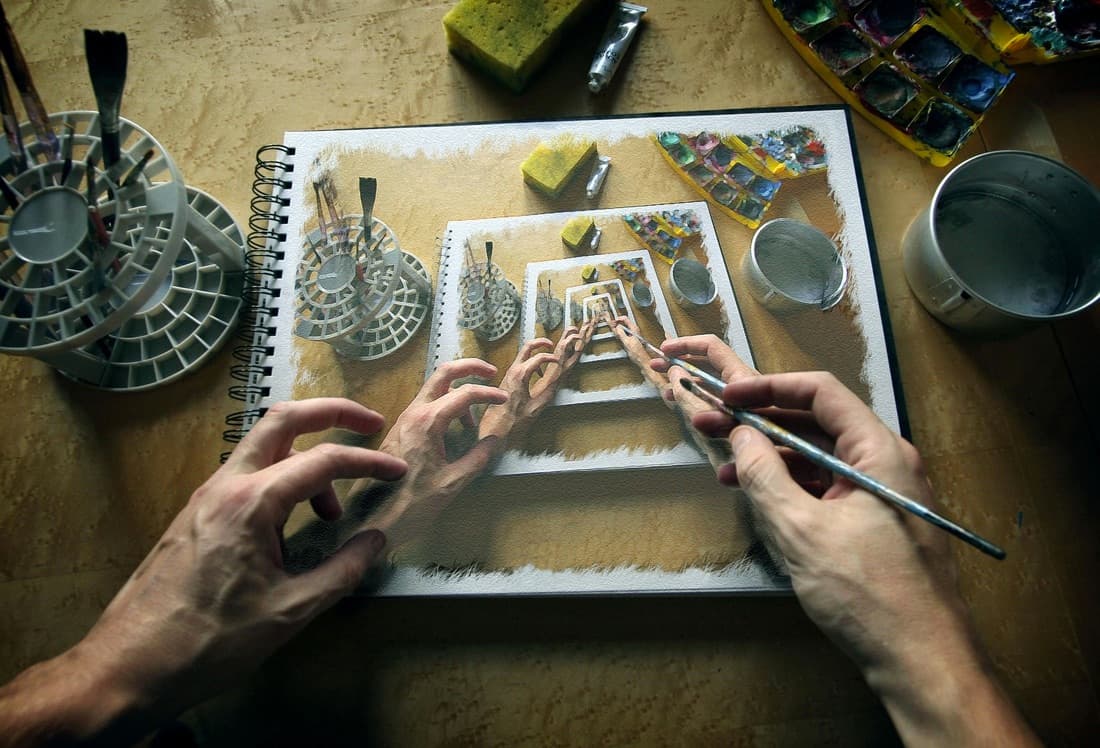
Visual references
04 / Colors & typography
Colors and typography
Brand colors
Each color maps to one side of the Craft + Pragmatism duality. Vermilion carries the warmth and heritage. Steel Blue carries the precision and clarity. Together they give the brand its tension.
Burnt Vermilion
Primary brand color
Color models
| HEX | |
| RGB | |
| CMYK | |
| OKLCH |
Pantone (approx.)
Character
A warm, earthy red-orange that communicates heritage, craft, and intellectual depth. Unlike typical tech blues or startup neons, Vermilion signals quality, maturity, and care.
Contrast
4.56:1 on white (AA)
Web safe
Yes (modern)
Print safe
Yes (CMYK)
Usage
Voice, CTAs, accents
Steel Blue
Secondary brand color
Color models
| HEX | |
| RGB | |
| CMYK | |
| OKLCH |
Pantone (approx.)
Character
A cool, professional blue that signals technical competence and precision engineering. Steel Blue balances Vermilion's warmth with a measured, analytical quality.
Contrast
8.98:1 on white (AAA)
Web safe
Yes (modern)
Print safe
Yes (CMYK)
Usage
Technical, data, structure
Primary Brand Color — Burnt Vermilion
50
subtle bg
100
soft bg
200
tag bg
300
chart fill
400
decorative, large text
500
PRIMARY
4.56:1 (AA)
600
text on light (AA)
700
links on tints
800
headings (AAA)
900
focus rings
Cool Counterweight — Ink/Steel
Ink
primary text in dark UIs
Steel
SECONDARY (technical competence)
8.98:1 (AAA)
Sky
charts on dark
Mist
cool section bg
Neutrals — Warm-leaning
Ink-900
body text (light)
Ink-700
secondary text
Sand-50
page bg (light)
Sand-100
cards
Stone-300
borders
Color distribution (70-20-10)
The heavy neutral majority sets a quiet tone. The brand speaks through restraint, not volume. Vermilion appears only in moments that matter: a call to action, a brand signature, a point of emphasis. Overusing it dilutes the signal. When orange is rare, it commands attention.
Neutrals (70-80%) — The stage — backgrounds, text, borders
Vermilion (10-15%) — The voice — CTAs, headings, brand moments
Steel Blue (5-10%) — The structure — diagrams, data, technical content
Semantic colors
Success
#1E7A46
Confirmations
Warning
#B45309
Caution states
Danger
#B3261E
Errors, destructive
Info
#0E7490
Neutral information
Typography
Three typefaces, three voices. Nohemi is the display voice: headings, hero text, and brand moments. Its geometric character feels distinctive and pairs naturally with the logo mark. DM Sans handles the reading layer: body text, paragraphs, and longer content where readability matters. Berkeley Mono speaks in code. The contrast between Nohemi's distinctive geometry and DM Sans's clean readability creates a system of craft meets pragmatism.
Systems so elegant, they become your signature.
Display voice (headings, hero, attention)
Nohemi
Geometric sans-serif with a distinctive character. Used for headings, hero text, display type, logo text, and all attention-grabbing moments. Weights 400–700 loaded as local woff2 files.
We build custom software solutions using transparent, tier-based pricing. From small tools to enterprise platforms, we match scope to budget with clear deliverables.
Body voice (reading, paragraphs, UI)
DM Sans
Clean, highly readable sans-serif. Variable font with optical sizing. Used for body text, paragraphs, descriptions, and longer content where readability matters most.
async function untangle(chaos) {
  const signal = await observe(chaos);
  const pattern = signal.reduce(elegant);
  return pattern;
}
Technical precision (code)
Berkeley Mono
Premium monospace font. Licensed variable weight.
05 / Aesthetics
The aesthetic foundation
Strange Loops' aesthetic is about holding tensions. Contradictions that create something emergent when kept in balance rather than resolved. This isn't minimalism. It's not maximalism. It's complexity that has been wrestled with and resolved.
Fearless engagement with complexity, but only in service of elegance.
Principles
Honest complexity
- Show everything that matters, hide nothing
- Don't infantilize users
- Dense information, clear structure
Transparency
- Expose state and inner workings
- Explicit over implicit
- Show the mechanism, not just the result
Earned craft
- Every element earns its place — nothing decorative
- Performance is design
- Limitation breeds creativity
Independence
- Timeless over fashionable
- Function first, aesthetics emerge
- Objective reasoning over convention
The three pillars
Warm Precision
Engineering rigor with human warmth
Curated Entropy
Maximalism with intention, complexity earned
Editorial Brutalism
Intellectual craft meets industrial honesty
Core tensions
Strange Loops' aesthetic holds these tensions without resolving them
| Tension | Not this | Not this either | But this |
|---|---|---|---|
| Density | Curated density | ||
| Temperature | Warm precision | ||
| Complexity | Earned depth | ||
| Time | Nostalgic futurism | ||
| Polish | Honest craft | ||
| Mood | Quiet power | ||
| Weirdness | Functional strangeness |
The calm confidence of someone who has seen complexity before and knows there’s always an elegant way through.
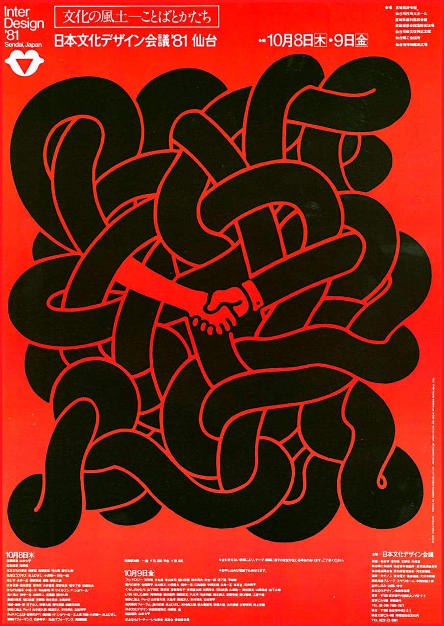
Influences

Editorial modernism rooted in Swiss/International Typographic Style. Grid-first layouts, typography-forward covers, geometric system visuals. Content-first design where serious ideas get beautiful treatment.
What to take: Intellectual confidence. Restrained boldness. The grid as foundation.
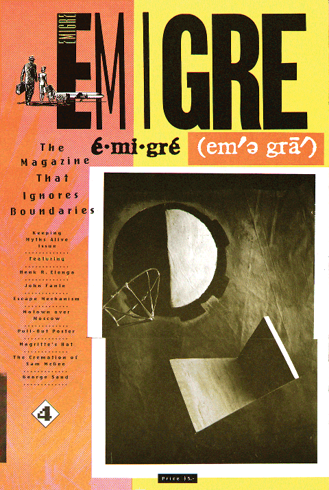
Emigre Magazine #1–32 (1984–1994)
Early-digital postmodern type-as-graphic design. Experimental typography, nonstandard grids, layered information — a deliberate break from Swiss/modernist cleanliness, made possible by early desktop publishing and Emigre's own fonts.
What to take: Constraints as creativity. Rule-breaking with purpose. Technology as creative fuel.
Shigeo Fukuda
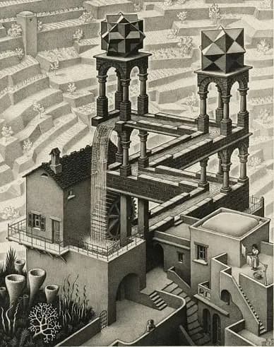
Visual illusion as communication. Escher-like wit meets Japanese graphic tradition. His purpose was to mystify, not conform.
What to take: Graphic wit. Complexity that reveals itself. Loops as visual language.
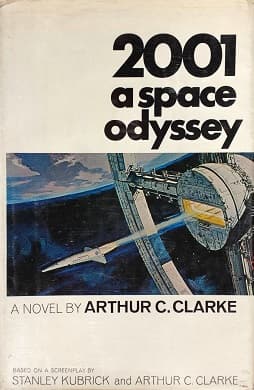
2001: A Space Odyssey
Kubrick's 1968 film transcends cinema to exist as a philosophical and visual experience. Profound ideas don't require exposition. Form IS content. The monolith as pure form.
What to take: Systems that reveal their purpose through use.
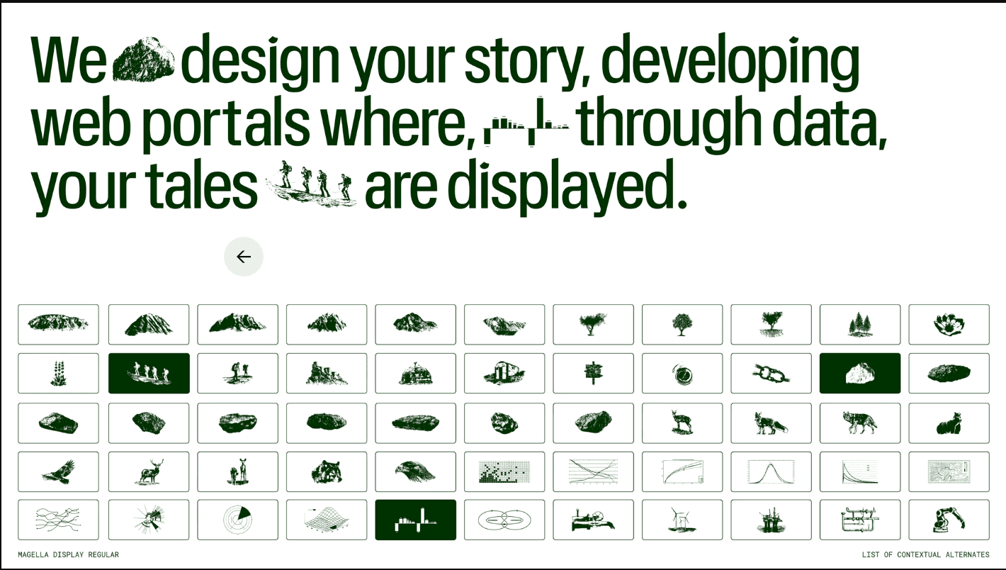
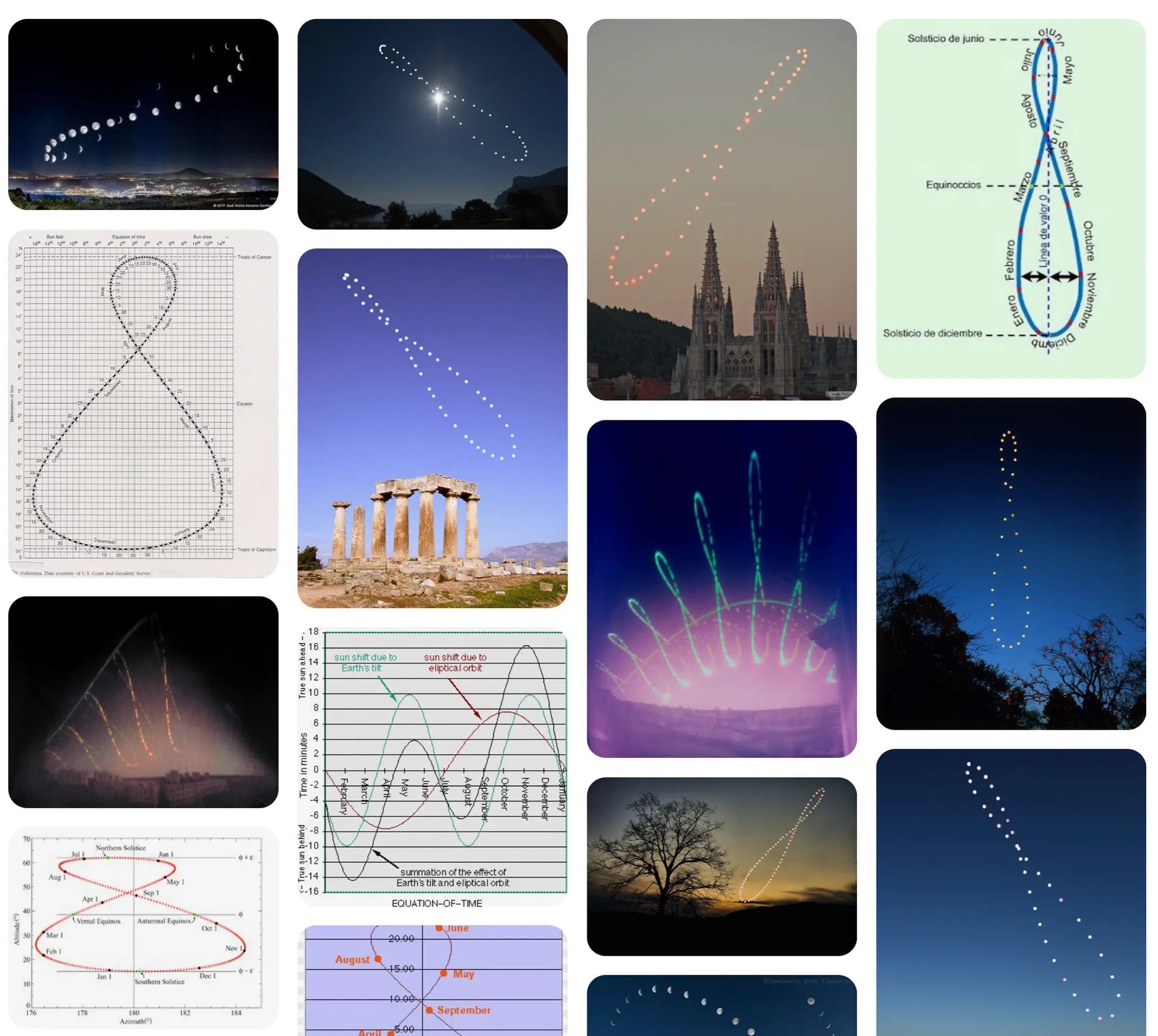
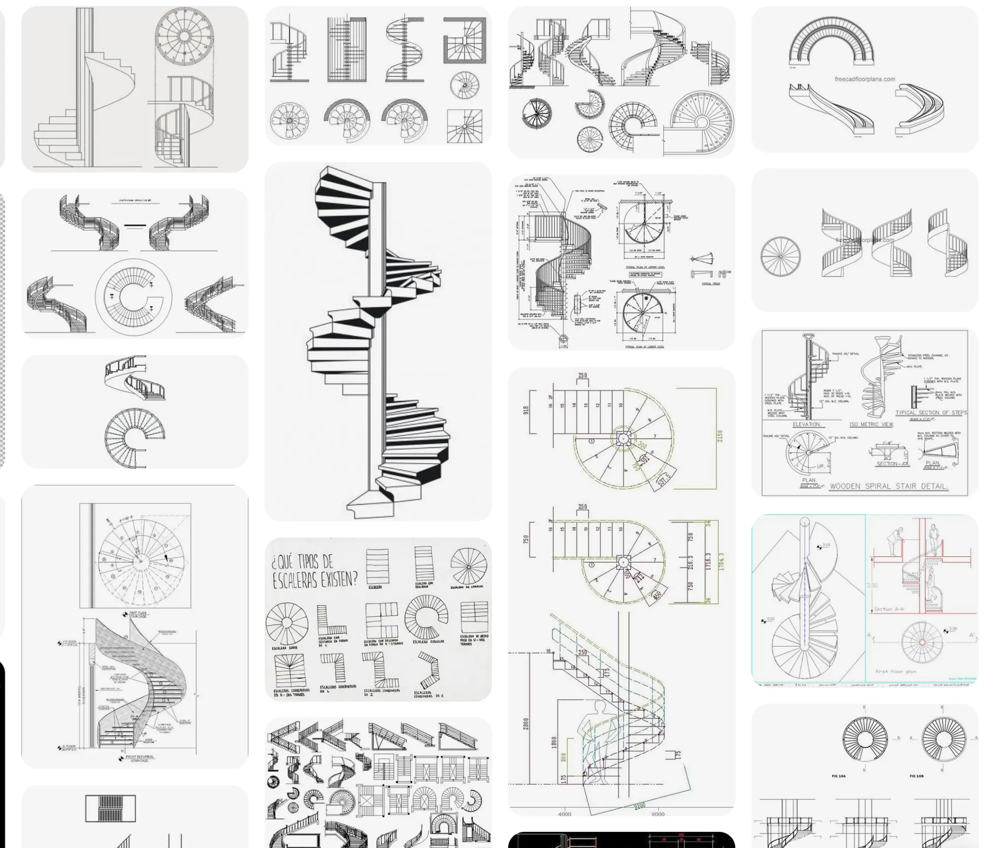
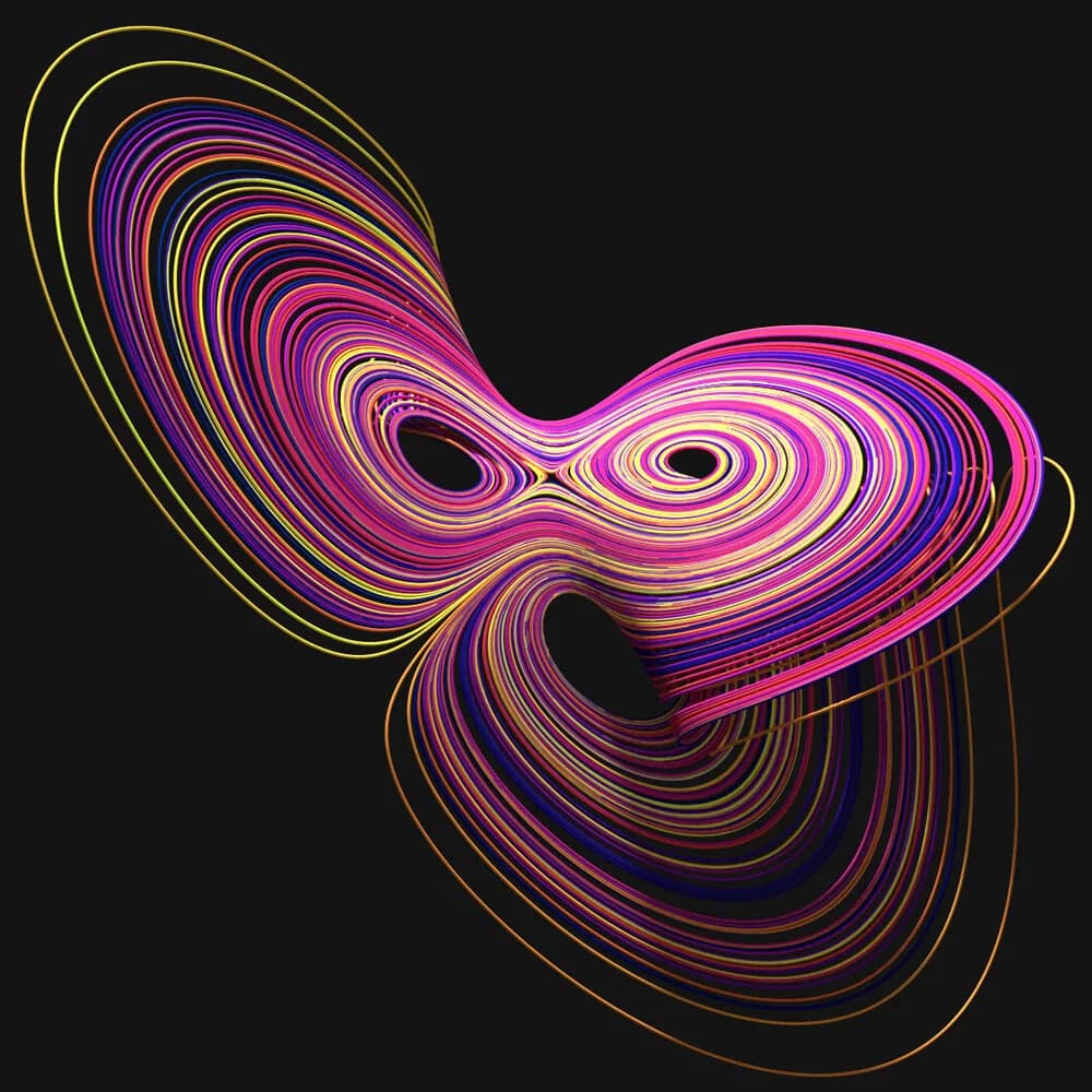
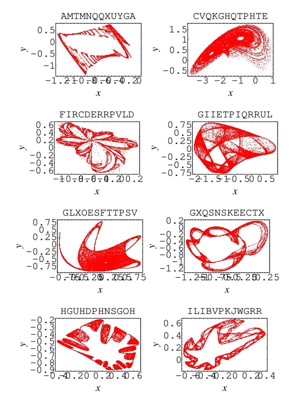
Topographic language
Topographic maps do visually what Strange Loops does for business systems: take infinite complexity and resolve it into elegant, readable form.
- Contour lines:
- The primary visual element. Continuous, flowing, organic but precise. Work in any weight, inherently in monotone. Nest naturally, creating depth through proximity.
- Elevation logic:
- Dense lines = steep complexity. Sparse lines = resolved simplicity. Peaks and valleys = focal points. Saddles = transitions.
- Parametric topography:
- Generative contour patterns. Mathematical precision with natural results. Unique every time but recognizable. Scales infinitely.
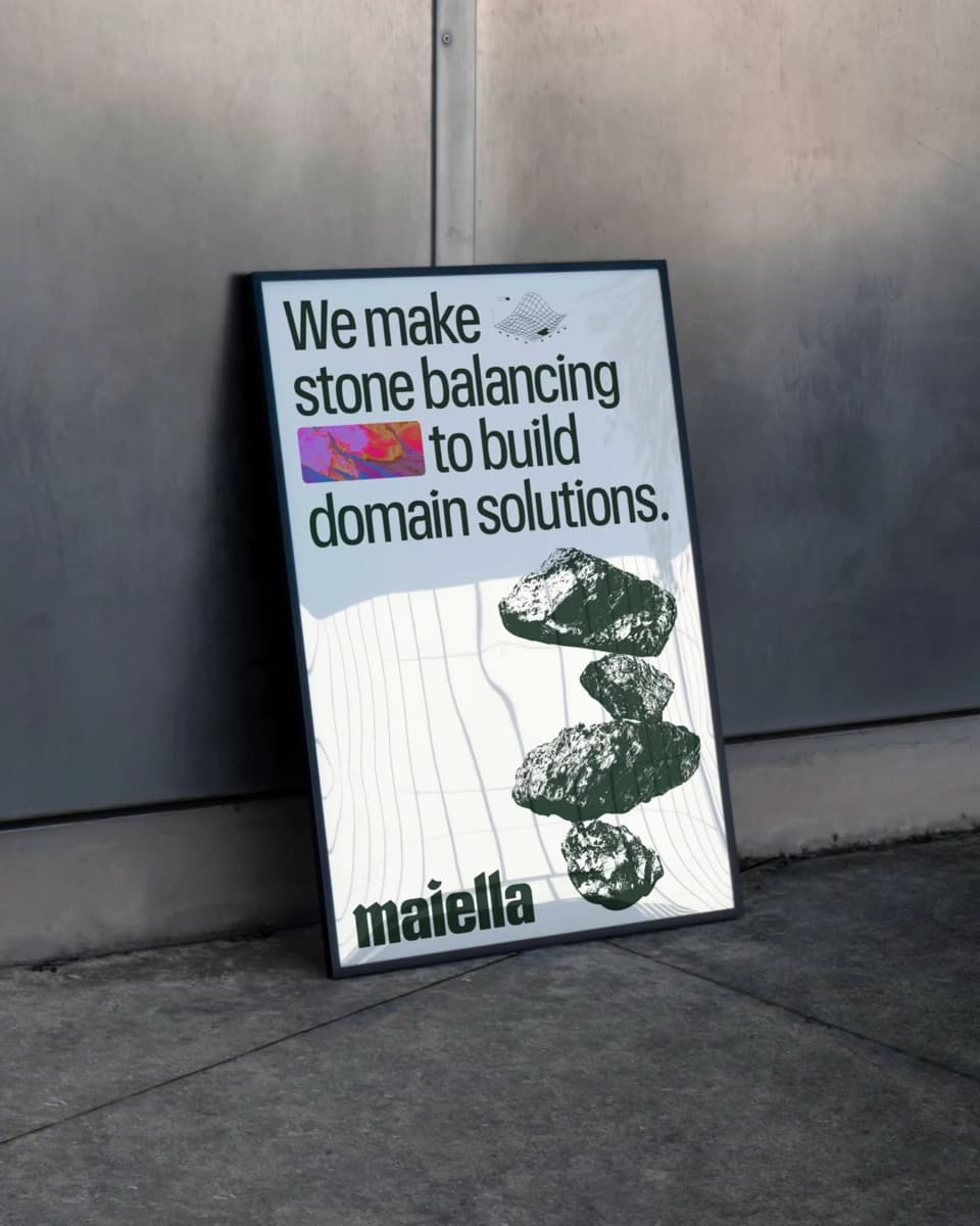
See the Maiella identity by Multiverse studio.
What to take: Nature as data visualization. Warmth through physical reality. Depth that rewards inspection.
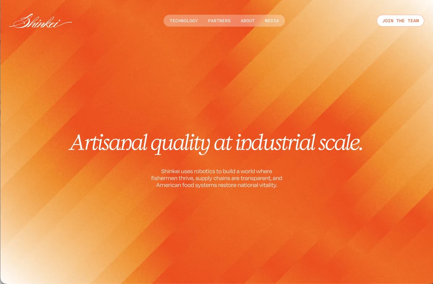
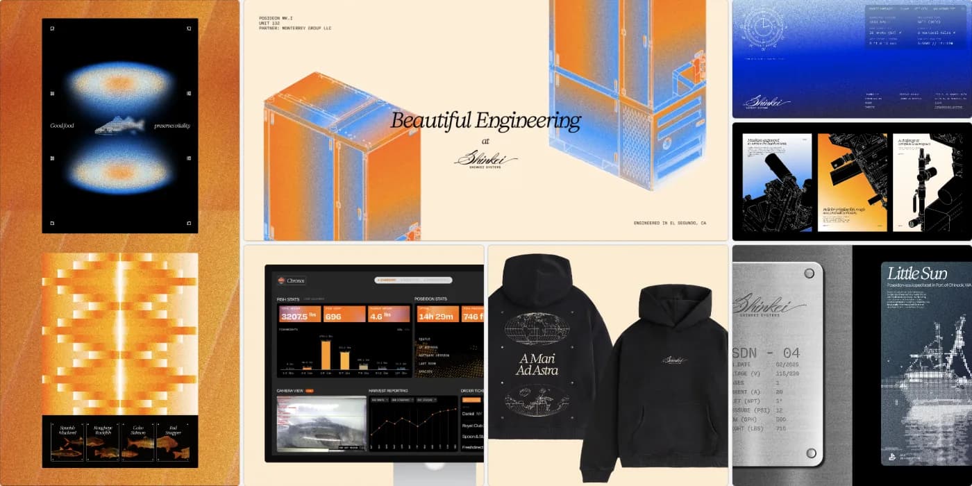
Artisanal quality at industrial scale. Cosmic ambition grounded in craft — engineering elevated to identity. Branding by Asimov Collective, who also did the Midjourney identity.
What to take: Engineering as aesthetic. Technical beauty without apology.
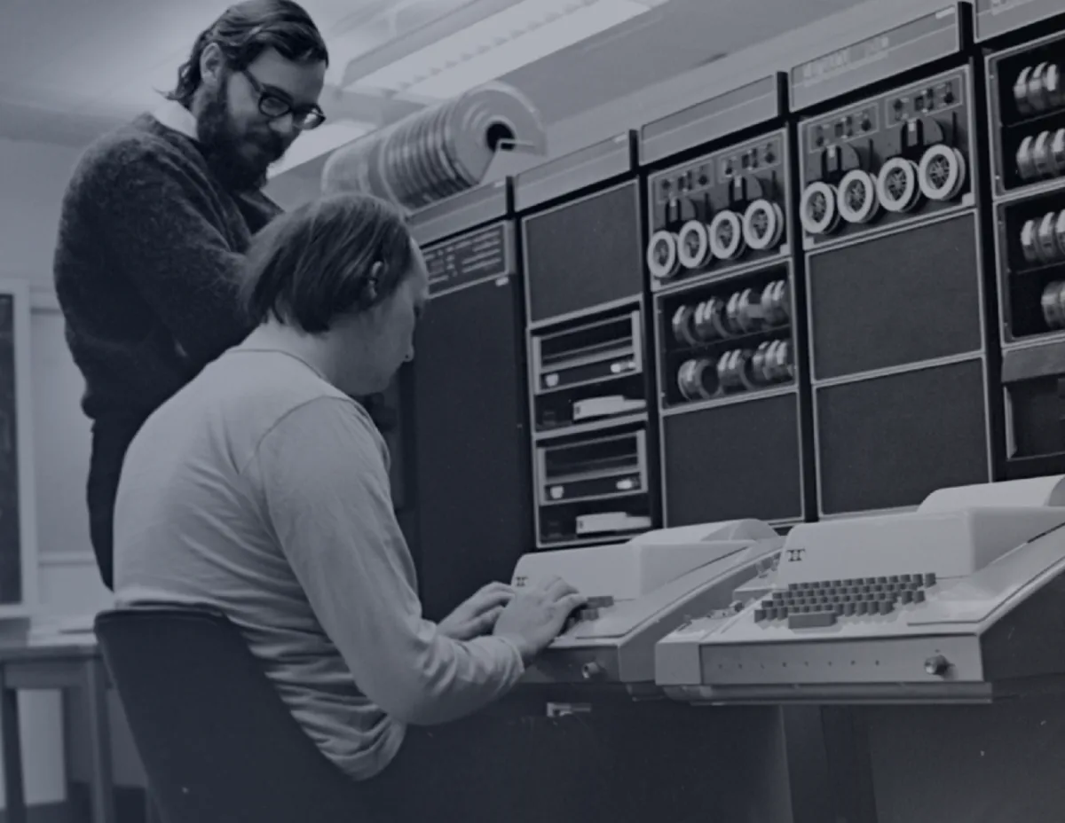
Bell Labs UNIX (The Unix Philosophy)
A system-design culture built around small, composable tools: each program does one thing well, and power comes from chaining them via pipes and text streams (stdin/stdout). Simplicity is preserved by keeping primitives orthogonal; complexity is assembled, not embedded.
What to take: Composability over monoliths. Small, sharp tools that chain into emergent power.
Visual inspiration
06 / Deliverables
Logo and deliverables
Logo mark
The mark has two optically compensated variants. The light variant is slightly heavier to counteract irradiation — the optical effect where light shapes on dark backgrounds appear to bleed outward. Use the correct variant for each context.
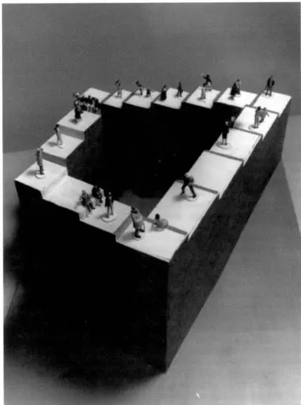
The Strange Loops mark is a geometric construction of interlocking hexagonal planes — an isometric impossible object that rewards closer inspection. It embodies the studio's core idea: systems of interdependent layers where clarity emerges from structured complexity.
Horizontal lockup (mark + wordmark)
Primary logo for headers, navigation, and horizontal spaces. The wordmark uses custom-spaced Nohemi typography with the same irradiation compensation as the mark — the SVG wordmark is a single unit, not HTML text.
Dark on light
Primary usage — headers, documents
Light on dark
Dark contexts — hero, footer
Vertical lockup
Secondary layout for square contexts — social avatars, app icons, presentation covers.
Dark on light
Light on dark
CSS invert — compensated SVG pending
On brand vermilion
Wordmark
Standalone typographic treatment. Three color variants for different contexts. These are SVG paths, not live text — use the files as-is.

Black

White

Orange (Vermilion)
Clear space
Margin reference files define the minimum protected area around each logo variant. Maintain at least this spacing from other elements.
Mark margins
Horizontal lockup margins

Wordmark margins
Mark on backgrounds
Website
#FAF8F6
Hero/marketing
#D2451A
Dark
#0E0D0C
Proposals/docs
#FFFFFF
Technical docs
#F4F7FA
| Variant | Color | Hex | Usage |
|---|---|---|---|
| Primary | Burnt Vermilion | #D2451A | Primary brand color on light backgrounds |
| On Dark | Sand-50 | #FAF8F6 | Logo on dark backgrounds |
| Mono Light | Ink-900 | #1A1614 | Black variant on light backgrounds |
| Mono Dark | White | #FFFFFF | White variant on dark backgrounds |
File deliverables
Logo Mark (Symbol Only)
The standalone symbol. Two optically compensated variants for light/dark backgrounds.
- SVG dark variant (logo-mark-dark.svg)
- SVG light/compensated variant (logo-mark-light.svg)
- PNG transparent @1x, @2x, @4x (dark)
- PNG transparent @1x, @2x, @4x (light)
- PDF dark variant
- PDF light variant
- Clear space reference (logo-mark-margins.svg)
Wordmark (Text Only)
"Strange Loops" as a typographic SVG treatment with irradiation compensation. Three color variants.
- SVG black (wordmark-dark.svg)
- SVG white (wordmark-light.svg)
- SVG orange/vermilion (wordmark-orange.svg)
- Clear space reference (wordmark-margins.svg)
Horizontal Lockup (Mark + Wordmark)
Primary logo for headers, navigation, and horizontal spaces. SVG paths, not live text.
- SVG dark (logo-horizontal-dark.svg)
- SVG light/compensated (logo-horizontal-light.svg)
- PDF horizontal lockup
- Clear space reference (logo-horizontal-margins.svg)
Vertical Lockup (Mark + Wordmark stacked)
Secondary layout for square contexts. Mark above wordmark.
- SVG dark (logo-vertical-dark.svg)
- SVG light/compensated variant
- Clear space reference (logo-vertical-margins.svg)
Typography System
Font files and configuration for the two-font system.
- Nohemi woff2 (Regular, Medium, SemiBold, Bold)
- DM Sans variable woff2 (Regular + Italic)
- Berkeley Mono variable woff2 (Regular + Italic)
- Font loading configuration (next/font)
Design System Tokens
Source-of-truth token definitions for colors, typography, spacing, borders, and motion.
- CSS custom properties (globals.css @theme)
- Tailwind CSS v4 theme configuration
- Color values in HEX, RGB, OKLCH, CMYK
Brand Specification Page
This document — living reference for identity, aesthetics, logo usage, and design tokens.
- Web page at /brand (this page)
- Print-optimized CSS (@media print)
Favicon & App Icons
Browser favicon, Apple touch icon, PWA icons derived from the logo mark.
- favicon.ico / icon.svg
- Apple touch icon 180px
- PWA icons (192px, 512px)
Everything specified here is a starting point. If something in this document sparks an idea that diverges from what's written, explore it. We trust the collaborator's craft and judgment.
07 / Logo in context
Real-world applications
The mark across platforms, documents, and interfaces. Each mock-up shows how the logo adapts to different sizes, backgrounds, and constraints while maintaining its identity.
Instagram profile
LinkedIn company page
Email signature
Slack workspace
GitHub organization
Browser tab / Favicon
Invoice
Contract / Agreement
Proposal cover
ProposalClient Name s.r.o.March 2026
App icon
Watermark / Presentation
08 / Applications
Brand applications
Concrete applications showing the brand identity at work across physical and digital touchpoints. Each mock-up demonstrates how the logo, typography, and color system come together in real contexts.
Business card — front & back
Strategický partner pre AI, web a digitálne platformy.
Web · SaaS · AI · Portály · CRM · E-commerce · API · DevOps
Andrej Nano
Founder & Engineer
andrej@strangeloops.sk
strangeloops.sk
In solitude, complexity dances, patterns emerge and become conscious.
Presentation — title slide
March 2026Technical Proposal
QualiTravel
Platform Rebuild
Instagram / Social post
Systems that
amplify human
agency.
strangeloops.sk
Story / Vertical format
Custom
software
at fair
prices.
strangeloops.sk
CLI tool — branded terminal output
$ npx @strangeloops/create my-project
Strange Loops — Project Scaffolder
Creating my-project with starter template...
✓ Initialized monorepo (turborepo)
✓ Created apps/web (Next.js 16)
✓ Created apps/api (Fastify + tRPC)
✓ Configured Better Auth + RBAC
✓ Connected Doppler secrets
Ready. cd my-project && npm run dev
Portfolio — case study card
QualiTravel
Travel agency management platform
Multi-GDS consolidation, IATA integration, automated commission tracking. From legacy system to modern B2B SaaS.
Merch — Hoodie
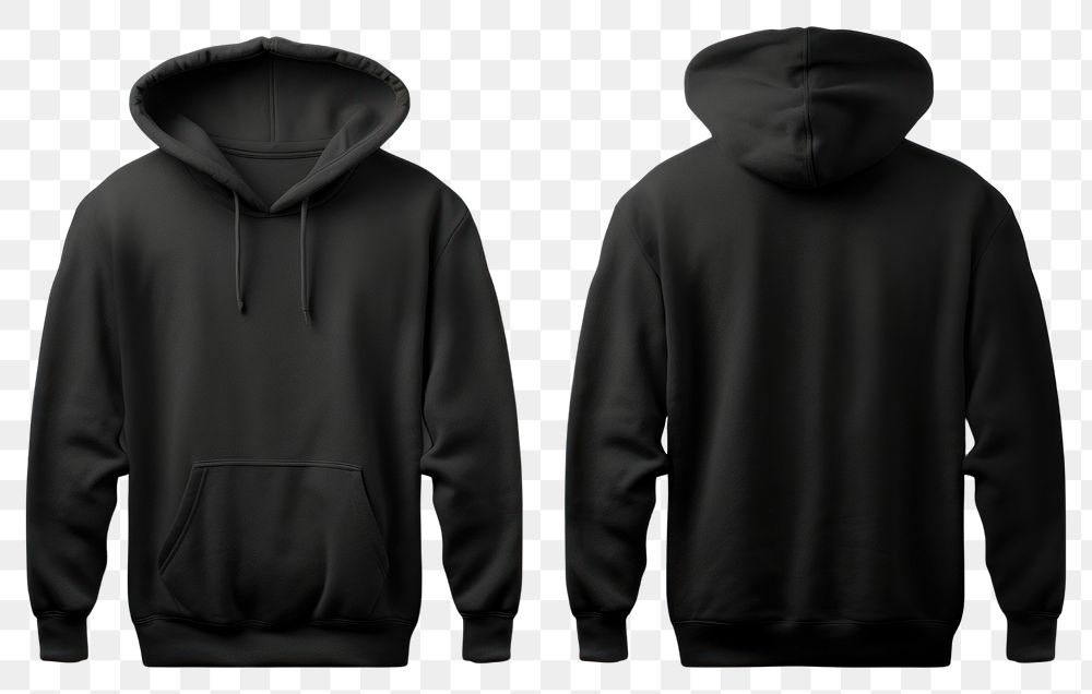
Strange Loops
Sticker / Badge
Strange Loops
Conference badge
Andrej Nano
Founder & Engineer
Strange Loops s.r.o.
Email / Newsletter header
Monthly dispatch — March 2026
404 / Error page
404
This loop doesn't lead anywhere.
09 / Design tokens
Design system tokens
The source of truth for every design decision on the web. These tokens define colors, typography, spacing, borders, and motion — everything that configures how the brand appears in code. Switch between formats to see the same values as a reference table, raw CSS custom properties, or Tailwind CSS theme configuration. Color values are available in HEX, RGB, OKLCH, and CMYK.
CSS units & syntax glossary
px
Pixels. Fixed size — 16px is always 16 screen pixels regardless of context.
em
Relative to the element's font size. 0.02em at 48px font = 0.96px. Used for letter-spacing so it scales proportionally with text size.
vw
Viewport width. 6vw = 6% of the browser window width. On a 1440px screen, 6vw = 86px.
clamp(min, preferred, max)
Fluid scaling with guardrails. clamp(40px, 6vw, 72px) means: “use 6% of viewport width, but never smaller than 40px or larger than 72px.”
ch
Width of the “0” character. 65ch = roughly 65 characters wide. Used for optimal reading line lengths.
cubic-bezier(x1, y1, x2, y2)
Easing curve for animations. Controls acceleration — how fast a transition starts and ends. (0, 0, 0.2, 1) = slow start, fast finish.
OKLCH
Perceptually uniform color space. Values are Lightness (0–1), Chroma (saturation), Hue (0–360). Colors with equal L values look equally bright to the human eye.
:root / var(--name)
CSS variables. :root defines them globally, var(--name) references them. Change the definition once, every usage updates.
Colors — Vermilion
| Token | HEX | Usage |
|---|---|---|
| vermilion-50 | #FBF0ED | Subtle background |
| vermilion-100 | #F7E0D8 | Soft background |
| vermilion-200 | #EFC2B2 | Tag background |
| vermilion-300 | #E69D85 | Chart fill |
| vermilion-400 | #DC7654 | Decorative |
| vermilion-500 | #D2451A | Primary — CTAs, brand |
| vermilion-600 | #B23B16 | Links on white (AA) |
| vermilion-700 | #933012 | Headings (AAA) |
| vermilion-800 | #74260E | Deep accents |
| vermilion-900 | #4D1909 | Focus rings |
Colors — Steel Blue
| Token | HEX | Usage |
|---|---|---|
| steel-50 | #F4F7FA | Cool section background |
| steel-500 | #4E8AB6 | Charts, data |
| steel-600 | #204D6C | Primary cool (AAA) |
| steel-700 | #1A3F58 | Dark steel |
| steel-900 | #0D2231 | Ink |
Colors — Neutrals
| Token | HEX | Usage |
|---|---|---|
| neutral-50 | #FAFAF9 | Page background |
| neutral-100 | #F5F4F2 | Cards, surfaces |
| neutral-200 | #E8E5E1 | Subtle borders |
| neutral-300 | #D9D5D0 | Borders, dividers |
| neutral-500 | #A69E96 | Placeholder text |
| neutral-700 | #645C55 | Secondary text |
| neutral-900 | #1A1614 | Primary text |
| neutral-950 | #0E0D0C | Dark background |
Typography
| Token | Value | Usage |
|---|---|---|
| font-display | Nohemi | Headings, hero, display, attention text |
| font-sans | DM Sans | Body, paragraphs, readable content |
| font-mono | Berkeley Mono | Code, technical values |
| h1 size | clamp(40px, 6vw, 72px) | Page titles |
| h1 tracking | 0.02em | Slight widening for Nohemi |
| h2 size | 32px | Section headings |
| h3 size | 24px | Subsection headings |
| body size | 16px / 24px | Default text |
| label tracking | 0.08em | Uppercase small labels |
Spacing
| Token | Value | Usage |
|---|---|---|
| space-1 | 4px | Minimum gap |
| space-2 | 8px | Tight spacing |
| space-3 | 12px | Button padding, small gaps |
| space-4 | 16px | Default padding |
| space-6 | 24px | Card padding, section gaps |
| space-8 | 32px | Medium sections |
| space-12 | 48px | Large sections |
| space-16 | 64px | Section padding |
| space-24 | 96px | Hero padding |
Borders & Shadows
| Token | Value | Usage |
|---|---|---|
| radius | 0 | All corners are sharp |
| radius-full | 9999px | Only for pills/avatars |
| shadow-sm | 0 1px 2px rgba(0,0,0,0.04) | Subtle elevation |
| border-color | #D9D5D0 | Default (neutral-300) |
Motion
| Token | Value | Usage |
|---|---|---|
| duration-fast | 100ms | Hover color changes |
| duration-normal | 150ms | Default transitions |
| duration-slow | 200ms | Layout shifts |
| duration-slower | 300ms | Page transitions |
| ease-out | cubic-bezier(0, 0, 0.2, 1) | Default easing |
These tokens are the deliverable.
The brand isn't a PDF — it's a system of values that configure how the design renders. Change a token, and every element that references it updates. This is what makes the brand maintainable, consistent, and alive.
A / Appendix
Studio inspirations
A reference list of design and development studios whose work, positioning, or craft we find worth studying. Hearts indicate personal affinity, not an objective ranking.
International
Slovak & Czech
| Studio | Rating | Note |
|---|---|---|
| GoodRequest | najlepšie lokálne štúdio/agentúra | |
| Mavora | zly dizajn/web ale velmi siroky zaber a output | |
| Studio Echt | moj vzor pre jasnost, znacku a podnikanie | |
| Freevision | ||
| Ques | ||
| Globerg | ||
| SCR Technologies | ||
| Sudo Labs | ||
| Cherry Peak | ||
| Nocta | ||
| Nextio | ||
| Grown Apps | ||
| A11 Studio | ||
| D Studio | ||
| Solver | ||
| Archtech | ||
| Sodehal | ||
| AMCEF | ||
| Datalan | ||
| YMS |